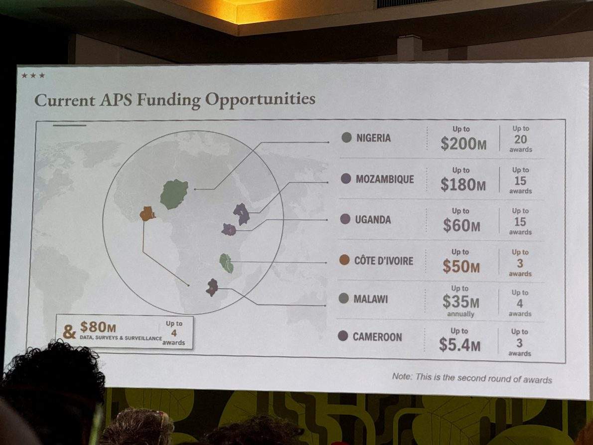
When you project a map of an entire continent on a screen at a major global health summit and manage to mislabel every single country, you aren't just making a casual typo. You are broadcasting a stunning lack of preparation to the exact partners you need to work with.
That is precisely what happened at the AIDS 2026 Conference in Rio de Janeiro. During a high-profile presentation regarding new U.S. health program funding agreements, the U.S. State Department displayed an AI-generated map of Africa that treated continental geography like a rough suggestion.
Nigeria, a coastal West African powerhouse, was shoved inland into the Sahara Desert. Mozambique was yanked from the southeast coast and dumped up north in the Horn of Africa. Côte d'Ivoire was dragged across the continent, and other regional boundaries were scrambled beyond recognition.
How a Lazy Slide Deck Sparked International Backlash
The presentation was led by Jeff Graham, the senior official overseeing the President's Emergency Plan for AIDS Relief (PEPFAR). Yet, the substance of the U.S. global health strategy quickly took a backseat to the glaring visual disaster on the projector.
Journalists, policy experts, and attendees like HIV activist Emily Bass immediately captured screenshots. Those images flooded LinkedIn, Substack, and other platforms. Soon, a technical review by Reuters revealed an artificial intelligence watermark on the graphic, pointing directly to OpenAI tools.
The State Department quickly walked it back. They issued statements acknowledging an unfortunate error caused by a team member who hastily altered the slide deck right before going live. They took full responsibility for the confusion.
An apology is fine, but it doesn't fix the deeper rot.
The Real Problem Isn't Just a Bad Graphic
People make mistakes. Staffers rush through slide decks under tight deadlines. But this specific blunder landed during a period of massive anxiety over international aid cuts.
International government funding for global HIV responses plunged 25 percent heading into 2026. Key organizations have watched foreign aid freezes shutter health care sites and stall critical vaccine developments. When an administration slashes budgets and reorganizes foreign health partnerships, showing up with an AI-generated map where nobody can find Nigeria or Mozambique signals something worse than incompetence.
It signals negligence.
Critics pointed out that if you can't be bothered to verify basic geography on a presentation slide, how seriously are you taking the actual health systems you claim you want to reshape? African delegates sat in that room—some representing the exact nations whose borders were arbitrarily warped by a chatbot prompt.
The Dangers of Unchecked AI in Diplomacy
We have hit a point where generative tools are doing the heavy lifting in environments that demand absolute precision. Government agencies are supposed to set a baseline of factual accuracy. Instead, relying on unverified AI outputs for international diplomacy turns serious policy rollouts into viral internet memes.
When your maps look like they were generated by a confused algorithm and rushed onto a global stage without a single human editorial check, you lose authority. You lose trust. And in global public health, trust is harder to rebuild than any physical infrastructure.
Check your sources. Verify your data. And if you're going to present a map to the world, look at it before you click publish.